Text class
A run of text with a single style.
The Text widget displays a string of text with single style. The string might break across multiple lines or might all be displayed on the same line depending on the layout constraints.
The style argument is optional. When omitted, the text will use the style from the closest enclosing DefaultTextStyle. If the given style's TextStyle.inherit property is true (the default), the given style will be merged with the closest enclosing DefaultTextStyle. This merging behavior is useful, for example, to make the text bold while using the default font family and size.
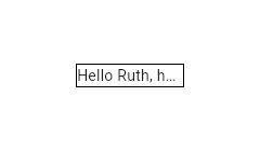
Container(
  width: 100,
  decoration: BoxDecoration(border: Border.all()),
  child: const Text(
    'Hello, how are you?',
    overflow: TextOverflow.ellipsis,
  ),
)1 is not equivalent to disabling soft wrapping with
softWrap. This is apparent when using TextOverflow.fade as the following
examples show.
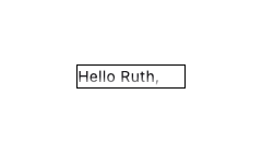
Here soft wrapping is enabled and the Text widget tries to wrap the words
"how are you?" to a second line. This is prevented by the maxLines value
of 1. The result is that a second line overflows and the fade appears in a
horizontal direction at the bottom.
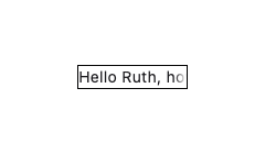
Here soft wrapping is disabled with softWrap: false and the Text widget
attempts to display its text in a single unbroken line. The result is that
the single line overflows and the fade appears in a vertical direction at
the right.
const Text(
  'Hello, how are you?',
  overflow: TextOverflow.fade,
  maxLines: 1,
)

// ...

const Text(
  'Hello, how are you?',
  overflow: TextOverflow.fade,
  softWrap: false,
)
Using the Text.rich constructor, the Text widget can display a paragraph with differently styled TextSpans. The sample that follows displays "Hello beautiful world" with different styles for each word.
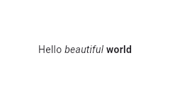
const Text.rich(
  TextSpan(
    text: 'Hello', // default text style
    children: <TextSpan>[
      TextSpan(text: ' beautiful ', style: TextStyle(fontStyle: FontStyle.italic)),
      TextSpan(text: 'world', style: TextStyle(fontWeight: FontWeight.bold)),
    ],
  ),
)
Interactivity
To make Text react to touch events, wrap it in a GestureDetector widget with a GestureDetector.onTap handler.
In a Material Design application, consider using a TextButton instead, or if that isn't appropriate, at least using an InkWell instead of GestureDetector.
To make sections of the text interactive, use RichText and specify a TapGestureRecognizer as the TextSpan.recognizer of the relevant part of the text.
Selection
Text is not selectable by default. To make a Text selectable, one can wrap a subtree with a SelectionArea widget. To exclude a part of a subtree under SelectionArea from selection, once can also wrap that part of the subtree with SelectionContainer.disabled.
To create a local project with this code sample, run:
flutter create --sample=widgets.Text.4 mysample
See also:
- RichText, which gives you more control over the text styles.
- DefaultTextStyle, which sets default styles for Text widgets.
- SelectableRegion, which provides an overview of the selection system.
- Inheritance
Constructors
- Text(String data, {Key? key, TextStyle? style, StrutStyle? strutStyle, TextAlign? textAlign, TextDirection? textDirection, Locale? locale, bool? softWrap, TextOverflow? overflow, @Deprecated('Use textScaler instead. ' 'Use of textScaleFactor was deprecated in preparation for the upcoming nonlinear text scaling support. ' 'This feature was deprecated after v3.12.0-2.0.pre.') double? textScaleFactor, TextScaler? textScaler, int? maxLines, String? semanticsLabel, String? semanticsIdentifier, TextWidthBasis? textWidthBasis, TextHeightBehavior? textHeightBehavior, Color? selectionColor})
-
Creates a text widget.
const
- Text.rich(InlineSpan textSpan, {Key? key, TextStyle? style, StrutStyle? strutStyle, TextAlign? textAlign, TextDirection? textDirection, Locale? locale, bool? softWrap, TextOverflow? overflow, @Deprecated('Use textScaler instead. ' 'Use of textScaleFactor was deprecated in preparation for the upcoming nonlinear text scaling support. ' 'This feature was deprecated after v3.12.0-2.0.pre.') double? textScaleFactor, TextScaler? textScaler, int? maxLines, String? semanticsLabel, String? semanticsIdentifier, TextWidthBasis? textWidthBasis, TextHeightBehavior? textHeightBehavior, Color? selectionColor})
-
Creates a text widget with a InlineSpan.
const
Properties
- data → String?
-
The text to display.
final
- hashCode → int
-
The hash code for this object.
no setterinherited
- key → Key?
-
Controls how one widget replaces another widget in the tree.
finalinherited
- locale → Locale?
-
Used to select a font when the same Unicode character can
be rendered differently, depending on the locale.
final
- maxLines → int?
-
An optional maximum number of lines for the text to span, wrapping if necessary.
If the text exceeds the given number of lines, it will be truncated according
to overflow.
final
- overflow → TextOverflow?
-
How visual overflow should be handled.
final
- runtimeType → Type
-
A representation of the runtime type of the object.
no setterinherited
- selectionColor → Color?
-
The color to use when painting the selection.
final
- semanticsIdentifier → String?
-
A unique identifier for the semantics node for this widget.
final
- semanticsLabel → String?
-
An alternative semantics label for this text.
final
- softWrap → bool?
-
Whether the text should break at soft line breaks.
final
- strutStyle → StrutStyle?
-
The strut style to use. Strut style defines the strut, which sets minimum
vertical layout metrics.
final
- style → TextStyle?
-
If non-null, the style to use for this text.
final
- textAlign → TextAlign?
-
How the text should be aligned horizontally.
final
- textDirection → TextDirection?
-
The directionality of the text.
final
- textHeightBehavior → TextHeightBehavior?
-
Defines how to apply TextStyle.height over and under text.
final
- textScaleFactor → double?
-
Deprecated. Will be removed in a future version of Flutter. Use
textScaler instead.
final
- textScaler → TextScaler?
-
The font scaling strategy to use when laying out and rendering the text.
final
- textSpan → InlineSpan?
-
The text to display as a InlineSpan.
final
- textWidthBasis → TextWidthBasis?
-
Defines how to measure the width of the rendered text.
final
Methods
-
build(
BuildContext context) → Widget -
Describes the part of the user interface represented by this widget.
override
-
createElement(
) → StatelessElement -
Creates a StatelessElement to manage this widget's location in the tree.
inherited
-
debugDescribeChildren(
) → List< DiagnosticsNode> -
Returns a list of DiagnosticsNode objects describing this node's
children.
inherited
-
debugFillProperties(
DiagnosticPropertiesBuilder properties) → void -
Add additional properties associated with the node.
override
-
noSuchMethod(
Invocation invocation) → dynamic -
Invoked when a nonexistent method or property is accessed.
inherited
-
toDiagnosticsNode(
{String? name, DiagnosticsTreeStyle? style}) → DiagnosticsNode -
Returns a debug representation of the object that is used by debugging
tools and by DiagnosticsNode.toStringDeep.
inherited
-
toString(
{DiagnosticLevel minLevel = DiagnosticLevel.info}) → String -
A string representation of this object.
inherited
-
toStringDeep(
{String prefixLineOne = '', String? prefixOtherLines, DiagnosticLevel minLevel = DiagnosticLevel.debug, int wrapWidth = 65}) → String -
Returns a string representation of this node and its descendants.
inherited
-
toStringShallow(
{String joiner = ', ', DiagnosticLevel minLevel = DiagnosticLevel.debug}) → String -
Returns a one-line detailed description of the object.
inherited
-
toStringShort(
) → String -
A short, textual description of this widget.
inherited
Operators
-
operator ==(
Object other) → bool -
The equality operator.
inherited