ListView class
A scrollable list of widgets arranged linearly.
ListView is the most commonly used scrolling widget. It displays its children one after another in the scroll direction. In the cross axis, the children are required to fill the ListView.
If non-null, the itemExtent forces the children to have the given extent in the scroll direction.
If non-null, the prototypeItem forces the children to have the same extent as the given widget in the scroll direction.
Specifying an itemExtent or an prototypeItem is more efficient than letting the children determine their own extent because the scrolling machinery can make use of the foreknowledge of the children's extent to save work, for example when the scroll position changes drastically.
You can't specify both itemExtent and prototypeItem, only one or none of them.
There are four options for constructing a ListView:
-
The default constructor takes an explicit List<Widget> of children. This constructor is appropriate for list views with a small number of children because constructing the List requires doing work for every child that could possibly be displayed in the list view instead of just those children that are actually visible.
-
The ListView.builder constructor takes an IndexedWidgetBuilder, which builds the children on demand. This constructor is appropriate for list views with a large (or infinite) number of children because the builder is called only for those children that are actually visible.
-
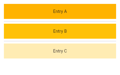
The ListView.separated constructor takes two IndexedWidgetBuilders:
itemBuilderbuilds child items on demand, andseparatorBuildersimilarly builds separator children which appear in between the child items. This constructor is appropriate for list views with a fixed number of children. -
The ListView.custom constructor takes a SliverChildDelegate, which provides the ability to customize additional aspects of the child model. For example, a SliverChildDelegate can control the algorithm used to estimate the size of children that are not actually visible.
To control the initial scroll offset of the scroll view, provide a controller with its ScrollController.initialScrollOffset property set.
By default, ListView will automatically pad the list's scrollable extremities to avoid partial obstructions indicated by MediaQuery's padding. To avoid this behavior, override with a zero padding property.

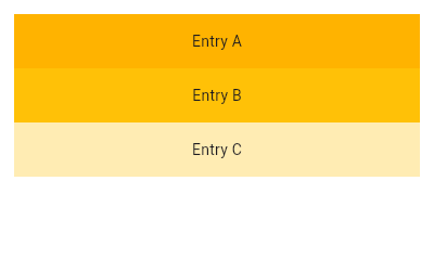
ListView(
  padding: const EdgeInsets.all(8),
  children: <Widget>[
    Container(
      height: 50,
      color: Colors.amber[600],
      child: const Center(child: Text('Entry A')),
    ),
    Container(
      height: 50,
      color: Colors.amber[500],
      child: const Center(child: Text('Entry B')),
    ),
    Container(
      height: 50,
      color: Colors.amber[100],
      child: const Center(child: Text('Entry C')),
    ),
  ],
)
final List<String> entries = <String>['A', 'B', 'C'];
final List<int> colorCodes = <int>[600, 500, 100];

Widget build(BuildContext context) {
  return ListView.builder(
    padding: const EdgeInsets.all(8),
    itemCount: entries.length,
    itemBuilder: (BuildContext context, int index) {
      return Container(
        height: 50,
        color: Colors.amber[colorCodes[index]],
        child: Center(child: Text('Entry ${entries[index]}')),
      );
    }
  );
}
final List<String> entries = <String>['A', 'B', 'C'];
final List<int> colorCodes = <int>[600, 500, 100];

Widget build(BuildContext context) {
  return ListView.separated(
    padding: const EdgeInsets.all(8),
    itemCount: entries.length,
    itemBuilder: (BuildContext context, int index) {
      return Container(
        height: 50,
        color: Colors.amber[colorCodes[index]],
        child: Center(child: Text('Entry ${entries[index]}')),
      );
    },
    separatorBuilder: (BuildContext context, int index) => const Divider(),
  );
}
Child elements' lifecycle
Creation
While laying out the list, visible children's elements, states and render objects will be created lazily based on existing widgets (such as when using the default constructor) or lazily provided ones (such as when using the ListView.builder constructor).
Destruction
When a child is scrolled out of view, the associated element subtree, states and render objects are destroyed. A new child at the same position in the list will be lazily recreated along with new elements, states and render objects when it is scrolled back.
Destruction mitigation
In order to preserve state as child elements are scrolled in and out of view, the following options are possible:
-
Moving the ownership of non-trivial UI-state-driving business logic out of the list child subtree. For instance, if a list contains posts with their number of upvotes coming from a cached network response, store the list of posts and upvote number in a data model outside the list. Let the list child UI subtree be easily recreate-able from the source-of-truth model object. Use StatefulWidgets in the child widget subtree to store instantaneous UI state only.
-
Letting KeepAlive be the root widget of the list child widget subtree that needs to be preserved. The KeepAlive widget marks the child subtree's top render object child for keepalive. When the associated top render object is scrolled out of view, the list keeps the child's render object (and by extension, its associated elements and states) in a cache list instead of destroying them. When scrolled back into view, the render object is repainted as-is (if it wasn't marked dirty in the interim).
This only works if
addAutomaticKeepAlivesandaddRepaintBoundariesare false since those parameters cause the ListView to wrap each child widget subtree with other widgets. -
Using AutomaticKeepAlive widgets (inserted by default when
addAutomaticKeepAlivesis true). AutomaticKeepAlive allows descendant widgets to control whether the subtree is actually kept alive or not. This behavior is in contrast with KeepAlive, which will unconditionally keep the subtree alive.As an example, the EditableText widget signals its list child element subtree to stay alive while its text field has input focus. If it doesn't have focus and no other descendants signaled for keepalive via a KeepAliveNotification, the list child element subtree will be destroyed when scrolled away.
AutomaticKeepAlive descendants typically signal it to be kept alive by using the AutomaticKeepAliveClientMixin, then implementing the AutomaticKeepAliveClientMixin.wantKeepAlive getter and calling AutomaticKeepAliveClientMixin.updateKeepAlive.
Transitioning to CustomScrollView
A ListView is basically a CustomScrollView with a single SliverList in its CustomScrollView.slivers property.
If ListView is no longer sufficient, for example because the scroll view is to have both a list and a grid, or because the list is to be combined with a SliverAppBar, etc, it is straight-forward to port code from using ListView to using CustomScrollView directly.
The key, scrollDirection, reverse, controller, primary, physics, and shrinkWrap properties on ListView map directly to the identically named properties on CustomScrollView.
The CustomScrollView.slivers property should be a list containing either:
- a SliverList if both itemExtent and prototypeItem were null;
- a SliverFixedExtentList if itemExtent was not null; or
- a SliverPrototypeExtentList if prototypeItem was not null.
The childrenDelegate property on ListView corresponds to the
SliverList.delegate (or SliverFixedExtentList.delegate) property. The
ListView constructor's children argument corresponds to the
childrenDelegate being a SliverChildListDelegate with that same
argument. The ListView.builder constructor's itemBuilder and
itemCount arguments correspond to the childrenDelegate being a
SliverChildBuilderDelegate with the equivalent arguments.
The padding property corresponds to having a SliverPadding in the CustomScrollView.slivers property instead of the list itself, and having the SliverList instead be a child of the SliverPadding.
CustomScrollViews don't automatically avoid obstructions from MediaQuery like ListViews do. To reproduce the behavior, wrap the slivers in SliverSafeAreas.
Once code has been ported to use CustomScrollView, other slivers, such as SliverGrid or SliverAppBar, can be put in the CustomScrollView.slivers list.
ListView(
  padding: const EdgeInsets.all(20.0),
  children: const <Widget>[
    Text("I'm dedicating every day to you"),
    Text('Domestic life was never quite my style'),
    Text('When you smile, you knock me out, I fall apart'),
    Text('And I thought I was so smart'),
  ],
)CustomScrollView(
slivers: <Widget>[
SliverPadding(
padding: const EdgeInsets.all(20.0),
sliver: SliverList(
delegate: SliverChildListDelegate(
<Widget>[
const Text("I'm dedicating every day to you"),
const Text('Domestic life was never quite my style'),
const Text('When you smile, you knock me out, I fall apart'),
const Text('And I thought I was so smart'),
],
),
),
),
],
)Special handling for an empty list
A common design pattern is to have a custom UI for an empty list. The best way to achieve this in Flutter is just conditionally replacing the ListView at build time with whatever widgets you need to show for the empty list state:
Widget build(BuildContext context) {
  return Scaffold(
    appBar: AppBar(title: const Text('Empty List Test')),
    body: itemCount > 0
      ? ListView.builder(
          itemCount: itemCount,
          itemBuilder: (BuildContext context, int index) {
            return ListTile(
              title: Text('Item ${index + 1}'),
            );
          },
        )
      : const Center(child: Text('No items')),
  );
}
Selection of list items
ListView has no built-in notion of a selected item or items. For a small example of how a caller might wire up basic item selection, see ListTile.selected.
To create a local project with this code sample, run:
flutter create --sample=widgets.ListView.7 mysample
ScrollViews are often decorated with Scrollbars and overscroll indicators, which are managed by the inherited ScrollBehavior. Placing a ScrollConfiguration above a ScrollView can modify these behaviors for that ScrollView, or can be managed app-wide by providing a ScrollBehavior to MaterialApp.scrollBehavior or CupertinoApp.scrollBehavior.
Persisting the scroll position during a session
Scroll views attempt to persist their scroll position using PageStorage. This can be disabled by setting ScrollController.keepScrollOffset to false on the controller. If it is enabled, using a PageStorageKey for the key of this widget is recommended to help disambiguate different scroll views from each other.
See also:
- SingleChildScrollView, which is a scrollable widget that has a single child.
- PageView, which is a scrolling list of child widgets that are each the size of the viewport.
- GridView, which is a scrollable, 2D array of widgets.
- CustomScrollView, which is a scrollable widget that creates custom scroll effects using slivers.
- ListBody, which arranges its children in a similar manner, but without scrolling.
- ScrollNotification and NotificationListener, which can be used to watch the scroll position without using a ScrollController.
- The catalog of layout widgets.
- Cookbook: Use lists
- Cookbook: Work with long lists
- Cookbook: Create a horizontal list
- Cookbook: Create lists with different types of items
- Cookbook: Implement swipe to dismiss
- Inheritance
Constructors
-
ListView({Key? key, Axis scrollDirection = Axis.vertical, bool reverse = false, ScrollController? controller, bool? primary, ScrollPhysics? physics, bool shrinkWrap = false, EdgeInsetsGeometry? padding, double? itemExtent, ItemExtentBuilder? itemExtentBuilder, Widget? prototypeItem, bool addAutomaticKeepAlives = true, bool addRepaintBoundaries = true, bool addSemanticIndexes = true, @Deprecated('Use scrollCacheExtent instead. ' 'This feature was deprecated after v3.41.0-0.0.pre.') double? cacheExtent, ScrollCacheExtent? scrollCacheExtent, List<
Widget> children = const <Widget>[], int? semanticChildCount, DragStartBehavior dragStartBehavior = DragStartBehavior.start, ScrollViewKeyboardDismissBehavior? keyboardDismissBehavior, String? restorationId, Clip clipBehavior = Clip.hardEdge, HitTestBehavior hitTestBehavior = HitTestBehavior.opaque}) - Creates a scrollable, linear array of widgets from an explicit List.
- ListView.builder({Key? key, Axis scrollDirection = Axis.vertical, bool reverse = false, ScrollController? controller, bool? primary, ScrollPhysics? physics, bool shrinkWrap = false, EdgeInsetsGeometry? padding, double? itemExtent, ItemExtentBuilder? itemExtentBuilder, Widget? prototypeItem, required NullableIndexedWidgetBuilder itemBuilder, ChildIndexGetter? findChildIndexCallback, int? itemCount, bool addAutomaticKeepAlives = true, bool addRepaintBoundaries = true, bool addSemanticIndexes = true, @Deprecated('Use scrollCacheExtent instead. ' 'This feature was deprecated after v3.41.0-0.0.pre.') double? cacheExtent, ScrollCacheExtent? scrollCacheExtent, int? semanticChildCount, DragStartBehavior dragStartBehavior = DragStartBehavior.start, ScrollViewKeyboardDismissBehavior? keyboardDismissBehavior, String? restorationId, Clip clipBehavior = Clip.hardEdge, HitTestBehavior hitTestBehavior = HitTestBehavior.opaque})
- Creates a scrollable, linear array of widgets that are created on demand.
- ListView.custom({Key? key, Axis scrollDirection = Axis.vertical, bool reverse = false, ScrollController? controller, bool? primary, ScrollPhysics? physics, bool shrinkWrap = false, EdgeInsetsGeometry? padding, double? itemExtent, Widget? prototypeItem, ItemExtentBuilder? itemExtentBuilder, required SliverChildDelegate childrenDelegate, @Deprecated('Use scrollCacheExtent instead. ' 'This feature was deprecated after v3.41.0-0.0.pre.') double? cacheExtent, ScrollCacheExtent? scrollCacheExtent, int? semanticChildCount, DragStartBehavior dragStartBehavior = DragStartBehavior.start, ScrollViewKeyboardDismissBehavior? keyboardDismissBehavior, String? restorationId, Clip clipBehavior = Clip.hardEdge, HitTestBehavior hitTestBehavior = HitTestBehavior.opaque})
-
Creates a scrollable, linear array of widgets with a custom child model.
const
- ListView.separated({Key? key, Axis scrollDirection = Axis.vertical, bool reverse = false, ScrollController? controller, bool? primary, ScrollPhysics? physics, bool shrinkWrap = false, EdgeInsetsGeometry? padding, required NullableIndexedWidgetBuilder itemBuilder, @Deprecated('Use findItemIndexCallback instead. ' 'findChildIndexCallback returns child indices (which include separators), ' 'while findItemIndexCallback returns item indices (which do not). ' 'If you were multiplying results by 2 to account for separators, ' 'you can remove that workaround when migrating to findItemIndexCallback. ' 'This feature was deprecated after v3.37.0-1.0.pre.') ChildIndexGetter? findChildIndexCallback, ChildIndexGetter? findItemIndexCallback, required IndexedWidgetBuilder separatorBuilder, required int itemCount, bool addAutomaticKeepAlives = true, bool addRepaintBoundaries = true, bool addSemanticIndexes = true, @Deprecated('Use scrollCacheExtent instead. ' 'This feature was deprecated after v3.41.0-0.0.pre.') double? cacheExtent, ScrollCacheExtent? scrollCacheExtent, DragStartBehavior dragStartBehavior = DragStartBehavior.start, ScrollViewKeyboardDismissBehavior? keyboardDismissBehavior, String? restorationId, Clip clipBehavior = Clip.hardEdge, HitTestBehavior hitTestBehavior = HitTestBehavior.opaque})
- Creates a fixed-length scrollable linear array of list "items" separated by list item "separators".
Properties
- anchor → double
-
The relative position of the zero scroll offset.
finalinherited
- cacheExtent → double?
-
Deprecated. Use scrollCacheExtent instead.
finalinherited
- center → Key?
-
The first child in the GrowthDirection.forward growth direction.
finalinherited
- childrenDelegate → SliverChildDelegate
-
A delegate that provides the children for the ListView.
final
- clipBehavior → Clip
-
The content will be clipped (or not) according to this option.
finalinherited
- controller → ScrollController?
-
An object that can be used to control the position to which this scroll
view is scrolled.
finalinherited
- dragStartBehavior → DragStartBehavior
-
Determines the way that drag start behavior is handled.
finalinherited
- hashCode → int
-
The hash code for this object.
no setterinherited
- hitTestBehavior → HitTestBehavior
-
Defines the behavior of gesture detector used in this Scrollable.
finalinherited
- itemExtent → double?
-
If non-null, forces the children to have the given extent in the scroll
direction.
final
- itemExtentBuilder → ItemExtentBuilder?
-
If non-null, forces the children to have the corresponding extent returned
by the builder.
final
- key → Key?
-
Controls how one widget replaces another widget in the tree.
finalinherited
- keyboardDismissBehavior → ScrollViewKeyboardDismissBehavior?
-
The ScrollViewKeyboardDismissBehavior defines how this ScrollView will
dismiss the keyboard automatically.
finalinherited
- padding → EdgeInsetsGeometry?
-
The amount of space by which to inset the children.
finalinherited
- paintOrder → SliverPaintOrder
-
The order in which to paint the slivers;
equivalently, the order in which to arrange them in the z-direction.
finalinherited
- physics → ScrollPhysics?
-
How the scroll view should respond to user input.
finalinherited
- primary → bool?
-
Whether this is the primary scroll view associated with the parent
PrimaryScrollController.
finalinherited
- prototypeItem → Widget?
-
If non-null, forces the children to have the same extent as the given
widget in the scroll direction.
final
- restorationId → String?
-
Restoration ID to save and restore the scroll offset of the scrollable.
finalinherited
- reverse → bool
-
Whether the scroll view scrolls in the reading direction.
finalinherited
- runtimeType → Type
-
A representation of the runtime type of the object.
no setterinherited
- scrollBehavior → ScrollBehavior?
-
A ScrollBehavior that will be applied to this widget individually.
finalinherited
- scrollCacheExtent → ScrollCacheExtent?
-
The viewport has an area before and after the visible area to cache items
that are about to become visible when the user scrolls.
finalinherited
- scrollDirection → Axis
-
The Axis along which the scroll view's offset increases.
finalinherited
- semanticChildCount → int?
-
The number of children that will contribute semantic information.
finalinherited
- shrinkWrap → bool
-
Whether the extent of the scroll view in the scrollDirection should be
determined by the contents being viewed.
finalinherited
Methods
-
build(
BuildContext context) → Widget -
Describes the part of the user interface represented by this widget.
inherited
-
buildChildLayout(
BuildContext context) → Widget -
Subclasses should override this method to build the layout model.
override
-
buildSlivers(
BuildContext context) → List< Widget> -
Build the list of widgets to place inside the viewport.
inherited
-
buildViewport(
BuildContext context, ViewportOffset offset, AxisDirection axisDirection, List< Widget> slivers) → Widget -
Build the viewport.
inherited
-
createElement(
) → StatelessElement -
Creates a StatelessElement to manage this widget's location in the tree.
inherited
-
debugDescribeChildren(
) → List< DiagnosticsNode> -
Returns a list of DiagnosticsNode objects describing this node's
children.
inherited
-
debugFillProperties(
DiagnosticPropertiesBuilder properties) → void -
Add additional properties associated with the node.
override
-
getDirection(
BuildContext context) → AxisDirection -
Returns the AxisDirection in which the scroll view scrolls.
inherited
-
noSuchMethod(
Invocation invocation) → dynamic -
Invoked when a nonexistent method or property is accessed.
inherited
-
toDiagnosticsNode(
{String? name, DiagnosticsTreeStyle? style}) → DiagnosticsNode -
Returns a debug representation of the object that is used by debugging
tools and by DiagnosticsNode.toStringDeep.
inherited
-
toString(
{DiagnosticLevel minLevel = DiagnosticLevel.info}) → String -
A string representation of this object.
inherited
-
toStringDeep(
{String prefixLineOne = '', String? prefixOtherLines, DiagnosticLevel minLevel = DiagnosticLevel.debug, int wrapWidth = 65}) → String -
Returns a string representation of this node and its descendants.
inherited
-
toStringShallow(
{String joiner = ', ', DiagnosticLevel minLevel = DiagnosticLevel.debug}) → String -
Returns a one-line detailed description of the object.
inherited
-
toStringShort(
) → String -
A short, textual description of this widget.
inherited
Operators
-
operator ==(
Object other) → bool -
The equality operator.
inherited