TextStyle class
An immutable style describing how to format and paint text.
Bold
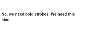
const Text(
  'No, we need bold strokes. We need this plan.',
  style: TextStyle(fontWeight: FontWeight.bold),
)
Italics
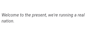
const Text(
  "Welcome to the present, we're running a real nation.",
  style: TextStyle(fontStyle: FontStyle.italic),
)
Opacity and Color
Each line here is progressively more opaque. The base color is Colors.black, and Color.withOpacity is used to create a derivative color with the desired opacity. The root TextSpan for this RichText widget is explicitly given the ambient DefaultTextStyle, since RichText does not do that automatically. The inner TextStyle objects are implicitly mixed with the parent TextSpan's TextSpan.style.
If color is specified, foreground must be null and vice versa. color is
treated as a shorthand for Paint()..color = color.
If backgroundColor is specified, background must be null and vice versa.
The backgroundColor is treated as a shorthand for
background: Paint()..color = backgroundColor.
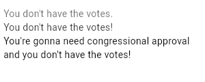
RichText(
  text: TextSpan(
    style: DefaultTextStyle.of(context).style,
    children: <TextSpan>[
      TextSpan(
        text: "You don't have the votes.\n",
        style: TextStyle(color: Colors.black.withValues(alpha: 0.6)),
      ),
      TextSpan(
        text: "You don't have the votes!\n",
        style: TextStyle(color: Colors.black.withValues(alpha: 0.8)),
      ),
      TextSpan(
        text: "You're gonna need congressional approval and you don't have the votes!\n",
        style: TextStyle(color: Colors.black.withValues(alpha: 1.0)),
      ),
    ],
  ),
)
Size
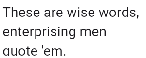
Text(
  "These are wise words, enterprising men quote 'em.",
  style: DefaultTextStyle.of(context).style.apply(fontSizeFactor: 2.0),
)
Line height
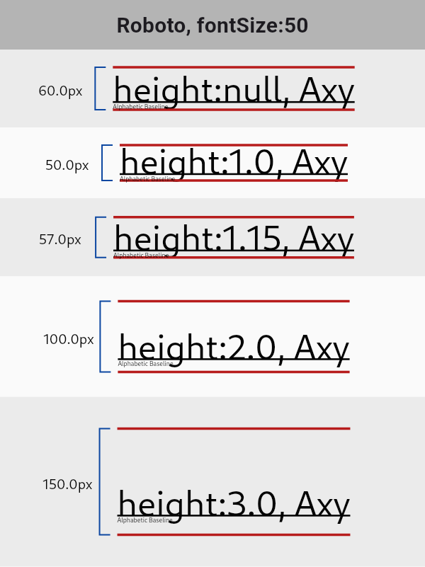
By default, text will layout with line height as defined by the font.
Font-metrics defined line height may be taller or shorter than the font size.
The height property allows manual adjustment of the height of the line as
a multiple of fontSize. For most fonts, setting height to 1.0 is not
the same as omitting or setting height to null. The following diagram
illustrates the difference between the font-metrics-defined line height and
the line height produced with height: 1.0 (also known as the EM-square):
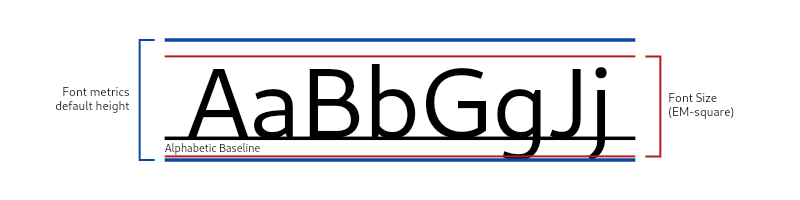
fontSize is set to 10, the final height of the line is
50 pixels.
const Text(
  'Ladies and gentlemen, you coulda been anywhere in the world tonight, but you’re here with us in New York City.',
  style: TextStyle(height: 5, fontSize: 10),
)
Examples of the resulting heights from different values of TextStyle.height:
See StrutStyle for further control of line height at the paragraph level.
Leading Distribution and Trimming
Leading is the vertical space
between glyphs from adjacent lines. Quantitatively, it is the line height
(see the previous section) subtracted by the font's ascent and descent.
It's possible to have a negative Leading if height is sufficiently
small.
When the height multiplier is null, leading and how it is distributed
is up to the font's
metrics.
When the height multiplier is specified, the exact behavior can be
configured via leadingDistribution and TextPainter.textHeightBehavior.
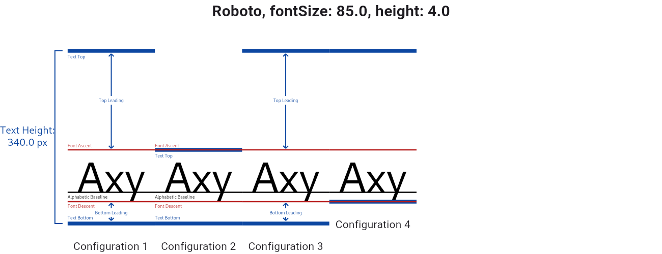
Above is a side-by-side comparison of different leadingDistribution and TextPainter.textHeightBehavior combinations.
- Configuration 1: The default. leadingDistribution is set to TextLeadingDistribution.proportional.
- Configuration 2: same as Configuration 1, except TextHeightBehavior.applyHeightToFirstAscent is set to false.
- Configuration 3: leadingDistribution is set to TextLeadingDistribution.even.
- Configuration 4: same as Configuration 3, except TextHeightBehavior.applyHeightToLastDescent is set to false.
The leadingDistribution property controls how leading is distributed over
and under the text. With TextLeadingDistribution.proportional
(Configuration 1), Top Leading : Bottom Leading = Font Ascent : Font Descent, which also means the alphabetic baseline divides the line height
into 2 parts proportional to the font's ascent and descent. With
TextLeadingDistribution.even (Configuration 3), Top Leading equals
Bottom Leading, and the glyphs are roughly centered within the allotted
line height.
The TextPainter.textHeightBehavior is a property that controls leading at
the paragraph level. The applyHeightToFirstAscent property is applied
after height and leadingDistribution. Setting it to false trims the
"Top Leading" of the text box to match the font's ascent if it's on the
first line (see Configuration 2). Similarly setting
applyHeightToLastDescent to false reduces "Bottom Leading" to 0 for the
last line of text (Configuration 4).
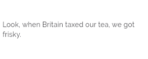
Wavy red underline with black text
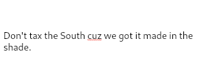
RichText(
  text: const TextSpan(
    text: "Don't tax the South ",
    children: <TextSpan>[
      TextSpan(
        text: 'cuz',
        style: TextStyle(
          color: Colors.black,
          decoration: TextDecoration.underline,
          decorationColor: Colors.red,
          decorationStyle: TextDecorationStyle.wavy,
        ),
      ),
      TextSpan(
        text: ' we got it made in the shade',
      ),
    ],
  ),
)
Borders and stroke (Foreground)

Stack(
  children: <Widget>[
    // Stroked text as border.
    Text(
      'Greetings, planet!',
      style: TextStyle(
        fontSize: 40,
        foreground: Paint()
          ..style = PaintingStyle.stroke
          ..strokeWidth = 6
          ..color = Colors.blue[700]!,
      ),
    ),
    // Solid text as fill.
    Text(
      'Greetings, planet!',
      style: TextStyle(
        fontSize: 40,
        color: Colors.grey[300],
      ),
    ),
  ],
)
Gradients (Foreground)

Text(
  'Greetings, planet!',
  style: TextStyle(
    fontSize: 40,
    foreground: Paint()
      ..shader = ui.Gradient.linear(
        const Offset(0, 20),
        const Offset(150, 20),
        <Color>[
          Colors.red,
          Colors.yellow,
        ],
      )
  ),
)
Custom Fonts
Custom fonts can be declared in the pubspec.yaml file as shown below:
flutter:
  fonts:
    - family: Raleway
      fonts:
        - asset: fonts/Raleway-Regular.ttf
        - asset: fonts/Raleway-Medium.ttf
          weight: 500
        - asset: assets/fonts/Raleway-SemiBold.ttf
          weight: 600
     - family: Schyler
       fonts:
         - asset: fonts/Schyler-Regular.ttf
         - asset: fonts/Schyler-Italic.ttf
           style: italic
The family property determines the name of the font, which you can use in
the fontFamily argument. The asset property is a path to the font file,
relative to the pubspec.yaml file. The weight property specifies the
weight of the glyph outlines in the file as an integer multiple of 100
between 100 and 900. This corresponds to the FontWeight class and can be
used in the fontWeight argument. The style property specifies whether the
outlines in the file are italic or normal. These values correspond to
the FontStyle class and can be used in the fontStyle argument.
To select a custom font, create TextStyle using the fontFamily argument as shown in the example below:
To use a font family defined in a package, the package argument must be
provided. For instance, suppose the font declaration above is in the
pubspec.yaml of a package named my_package which the app depends on.
Then creating the TextStyle is done as follows:
const TextStyle(fontFamily: 'Raleway', package: 'my_package')
If the package internally uses the font it defines, it should still specify
the package argument when creating the text style as in the example above.
A package can also provide font files without declaring a font in its
pubspec.yaml. These files should then be in the lib/ folder of the
package. The font files will not automatically be bundled in the app, instead
the app can use these selectively when declaring a font. Suppose a package
named my_package has:
lib/fonts/Raleway-Medium.ttf
Then the app can declare a font like in the example below:
flutter:
  fonts:
    - family: Raleway
      fonts:
        - asset: assets/fonts/Raleway-Regular.ttf
        - asset: packages/my_package/fonts/Raleway-Medium.ttf
          weight: 500
The lib/ is implied, so it should not be included in the asset path.
In this case, since the app locally defines the font, the TextStyle is
created without the package argument:
const TextStyle(fontFamily: 'Raleway')Supported font formats
Font formats currently supported by Flutter:
.ttc.ttf.otf
Flutter does not support .woff and .woff2 fonts for all platforms.
Custom Font Fallback
A custom fontFamilyFallback list can be provided. The list should be an ordered list of strings of font family names in the order they will be attempted.
The fonts in fontFamilyFallback will be used only if the requested glyph is not present in the fontFamily.
The fallback order is:
- fontFamily
- fontFamilyFallback in order of first to last.
- System fallback fonts which will vary depending on platform.
The glyph used will always be the first matching version in fallback order.
The fontFamilyFallback property is commonly used to specify different font families for multilingual text spans as well as separate fonts for glyphs such as emojis.
Raleway will be attempted
to be resolved with Noto Sans CJK SC, and then with Noto Color Emoji:
const TextStyle(
  fontFamily: 'Raleway',
  fontFamilyFallback: <String>[
    'Noto Sans CJK SC',
    'Noto Color Emoji',
  ],
)
If all custom fallback font families are exhausted and no match was found or no custom fallback was provided, the platform font fallback will be used.
Inconsistent platform fonts
By default, fonts differ depending on the platform.
- The default font-family for
Android,FuchsiaandLinuxisRoboto. - The default font-family for
iOSisSF Pro Display/SF Pro Text. - The default font-family for
MacOSis.AppleSystemUIFont. - The default font-family for
WindowsisSegoe UI.
Since Flutter's font discovery for default fonts depends on the fonts present on the device, it is not safe to assume all default fonts will be available or consistent across devices.
A known example of this is that Samsung devices ship with a CJK font that has smaller line spacing than the Android default. This results in Samsung devices displaying more tightly spaced text than on other Android devices when no custom font is specified.
To avoid this, a custom font should be specified if absolute font consistency is required for your application.
See also:
- Text, the widget for showing text in a single style.
- DefaultTextStyle, the widget that specifies the default text styles for Text widgets, configured using a TextStyle.
- RichText, the widget for showing a paragraph of mix-style text.
- TextSpan, the class that wraps a TextStyle for the purposes of passing it to a RichText.
- TextStyle, the class in the dart:ui library.
- Cookbook: Use a custom font
- Cookbook: Use themes to share colors and font styles
- Mixed-in types
- Implementers
- Annotations
Constructors
-
TextStyle({bool inherit = true, Color? color, Color? backgroundColor, double? fontSize, FontWeight? fontWeight, FontStyle? fontStyle, double? letterSpacing, double? wordSpacing, TextBaseline? textBaseline, double? height, TextLeadingDistribution? leadingDistribution, Locale? locale, Paint? foreground, Paint? background, List<
Shadow> ? shadows, List<FontFeature> ? fontFeatures, List<FontVariation> ? fontVariations, TextDecoration? decoration, Color? decorationColor, TextDecorationStyle? decorationStyle, double? decorationThickness, String? debugLabel, String? fontFamily, List<String> ? fontFamilyFallback, String? package, TextOverflow? overflow}) -
Creates a text style.
const
Properties
- background → Paint?
-
The paint drawn as a background for the text.
final
- backgroundColor → Color?
-
The color to use as the background for the text.
final
- color → Color?
-
The color to use when painting the text.
final
- debugLabel → String?
-
A human-readable description of this text style.
final
- decoration → TextDecoration?
-
The decorations to paint near the text (e.g., an underline).
final
- decorationColor → Color?
-
The color in which to paint the text decorations.
final
- decorationStyle → TextDecorationStyle?
-
The style in which to paint the text decorations (e.g., dashed).
final
- decorationThickness → double?
-
The thickness of the decoration stroke as a multiplier of the thickness
defined by the font.
final
- fontFamily → String?
-
The name of the font to use when painting the text (e.g., Roboto).
final
-
fontFamilyFallback
→ List<
String> ? -
The ordered list of font families to fall back on when a glyph cannot be
found in a higher priority font family.
no setter
-
fontFeatures
→ List<
FontFeature> ? -
A list of FontFeatures that affect how the font selects glyphs.
final
- fontSize → double?
-
The size of fonts (in logical pixels) to use when painting the text.
final
- fontStyle → FontStyle?
-
The typeface variant to use when drawing the letters (e.g., italics).
final
-
fontVariations
→ List<
FontVariation> ? -
A list of FontVariations that affect how a variable font is rendered.
final
- fontWeight → FontWeight?
-
The typeface thickness to use when painting the text (e.g., bold).
final
- foreground → Paint?
-
The paint drawn as a foreground for the text.
final
- hashCode → int
-
The hash code for this object.
no setteroverride
- height → double?
-
The height of this text span, as a multiple of the font size.
final
- inherit → bool
-
Whether null values in this TextStyle can be replaced with their value
in another TextStyle using merge.
final
- leadingDistribution → TextLeadingDistribution?
-
How the vertical space added by the height multiplier should be
distributed over and under the text.
final
- letterSpacing → double?
-
The amount of space (in logical pixels) to add between each letter.
A negative value can be used to bring the letters closer.
final
- locale → Locale?
-
The locale used to select region-specific glyphs.
final
- overflow → TextOverflow?
-
How visual text overflow should be handled.
final
- runtimeType → Type
-
A representation of the runtime type of the object.
no setterinherited
-
shadows
→ List<
Shadow> ? -
A list of Shadows that will be painted underneath the text.
final
- textBaseline → TextBaseline?
-
The common baseline that should be aligned between this text span and its
parent text span, or, for the root text spans, with the line box.
final
- wordSpacing → double?
-
The amount of space (in logical pixels) to add at each sequence of
white-space (i.e. between each word). A negative value can be used to
bring the words closer.
final
Methods
-
apply(
{Color? color, Color? backgroundColor, TextDecoration? decoration, Color? decorationColor, TextDecorationStyle? decorationStyle, double decorationThicknessFactor = 1.0, double decorationThicknessDelta = 0.0, String? fontFamily, List< String> ? fontFamilyFallback, double fontSizeFactor = 1.0, double fontSizeDelta = 0.0, int fontWeightDelta = 0, FontStyle? fontStyle, double letterSpacingFactor = 1.0, double letterSpacingDelta = 0.0, double wordSpacingFactor = 1.0, double wordSpacingDelta = 0.0, double heightFactor = 1.0, double heightDelta = 0.0, TextBaseline? textBaseline, TextLeadingDistribution? leadingDistribution, Locale? locale, List<Shadow> ? shadows, List<FontFeature> ? fontFeatures, List<FontVariation> ? fontVariations, String? package, TextOverflow? overflow}) → TextStyle - Creates a copy of this text style replacing or altering the specified properties.
-
compareTo(
TextStyle other) → RenderComparison - Describe the difference between this style and another, in terms of how much damage it will make to the rendering.
-
copyWith(
{bool? inherit, Color? color, Color? backgroundColor, double? fontSize, FontWeight? fontWeight, FontStyle? fontStyle, double? letterSpacing, double? wordSpacing, TextBaseline? textBaseline, double? height, TextLeadingDistribution? leadingDistribution, Locale? locale, Paint? foreground, Paint? background, List< Shadow> ? shadows, List<FontFeature> ? fontFeatures, List<FontVariation> ? fontVariations, TextDecoration? decoration, Color? decorationColor, TextDecorationStyle? decorationStyle, double? decorationThickness, String? debugLabel, String? fontFamily, List<String> ? fontFamilyFallback, String? package, TextOverflow? overflow}) → TextStyle - Creates a copy of this text style but with the given fields replaced with the new values.
-
debugFillProperties(
DiagnosticPropertiesBuilder properties, {String prefix = ''}) → void -
Adds all properties prefixing property names with the optional
prefix.override -
getParagraphStyle(
{TextAlign? textAlign, TextDirection? textDirection, TextScaler textScaler = TextScaler.noScaling, String? ellipsis, int? maxLines, TextHeightBehavior? textHeightBehavior, Locale? locale, String? fontFamily, double? fontSize, FontWeight? fontWeight, FontStyle? fontStyle, double? height, StrutStyle? strutStyle}) → ParagraphStyle -
The style information for paragraphs, encoded for use by
dart:ui. -
getTextStyle(
{double textScaleFactor = 1.0, TextScaler textScaler = TextScaler.noScaling}) → TextStyle -
The style information for text runs, encoded for use by
dart:ui. -
merge(
TextStyle? other) → TextStyle -
Returns a new text style that is a combination of this style and the given
otherstyle. -
noSuchMethod(
Invocation invocation) → dynamic -
Invoked when a nonexistent method or property is accessed.
inherited
-
toDiagnosticsNode(
{String? name, DiagnosticsTreeStyle? style}) → DiagnosticsNode -
Returns a debug representation of the object that is used by debugging
tools and by DiagnosticsNode.toStringDeep.
inherited
-
toString(
{DiagnosticLevel minLevel = DiagnosticLevel.info}) → String -
A string representation of this object.
inherited
-
toStringShort(
) → String -
A brief description of this object, usually just the runtimeType and the
hashCode.
override
Operators
-
operator ==(
Object other) → bool -
The equality operator.
override