BoxDecoration class
An immutable description of how to paint a box.
The BoxDecoration class provides a variety of ways to draw a box.
The box has a border, a body, and may cast a boxShadow.
The shape of the box can be BoxShape.circle or BoxShape.rectangle. If it is BoxShape.rectangle, then the borderRadius property can be used to make it a rounded rectangle (RRect).
The body of the box is painted in layers. The bottom-most layer is the color, which fills the box. Above that is the gradient, which also fills the box. Finally there is the image, the precise alignment of which is controlled by the DecorationImage class.
The border paints over the body; the boxShadow, naturally, paints below it.

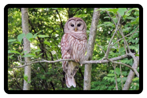
Container(
  decoration: BoxDecoration(
    color: const Color(0xff7c94b6),
    image: const DecorationImage(
      image: NetworkImage('https://flutter.github.io/assets-for-api-docs/assets/widgets/owl-2.jpg'),
      fit: BoxFit.cover,
    ),
    border: Border.all(
      width: 8,
    ),
    borderRadius: BorderRadius.circular(12),
  ),
)
The shape or the borderRadius won't clip the children of the decorated Container. If the clip is required, insert a clip widget (e.g., ClipRect, ClipRRect, ClipPath) as the child of the Container. Be aware that clipping may be costly in terms of performance.
See also:
- DecoratedBox and Container, widgets that can be configured with BoxDecoration objects.
- DecoratedSliver, a widget that can be configured with a BoxDecoration that is converted to render with slivers.
- CustomPaint, a widget that lets you draw arbitrary graphics.
- Decoration, the base class which lets you define other decorations.
- Inheritance
-
- Object
- Decoration
- BoxDecoration
Constructors
-
BoxDecoration({Color? color, DecorationImage? image, BoxBorder? border, BorderRadiusGeometry? borderRadius, List<
BoxShadow> ? boxShadow, Gradient? gradient, BlendMode? backgroundBlendMode, BoxShape shape = BoxShape.rectangle}) -
Creates a box decoration.
const
Properties
- backgroundBlendMode → BlendMode?
-
The blend mode applied to the color or gradient background of the box.
final
- border → BoxBorder?
-
A border to draw above the background color, gradient, or image.
final
- borderRadius → BorderRadiusGeometry?
-
If non-null, the corners of this box are rounded by this BorderRadius.
final
-
boxShadow
→ List<
BoxShadow> ? -
A list of shadows cast by this box behind the box.
final
- color → Color?
-
The color to fill in the background of the box.
final
- gradient → Gradient?
-
A gradient to use when filling the box.
final
- hashCode → int
-
The hash code for this object.
no setteroverride
- image → DecorationImage?
-
An image to paint above the background color or gradient.
final
- isComplex → bool
-
Whether this decoration is complex enough to benefit from caching its painting.
no setteroverride
- padding → EdgeInsetsGeometry
-
Returns the insets to apply when using this decoration on a box
that has contents, so that the contents do not overlap the edges
of the decoration. For example, if the decoration draws a frame
around its edge, the padding would return the distance by which
to inset the children so as to not overlap the frame.
no setteroverride
- runtimeType → Type
-
A representation of the runtime type of the object.
no setterinherited
- shape → BoxShape
-
The shape to fill the background color, gradient, and image into and
to cast as the boxShadow.
final
Methods
-
copyWith(
{Color? color, DecorationImage? image, BoxBorder? border, BorderRadiusGeometry? borderRadius, List< BoxShadow> ? boxShadow, Gradient? gradient, BlendMode? backgroundBlendMode, BoxShape? shape}) → BoxDecoration - Creates a copy of this object but with the given fields replaced with the new values.
-
createBoxPainter(
[VoidCallback? onChanged]) → BoxPainter -
Returns a BoxPainter that will paint this decoration.
override
-
debugAssertIsValid(
) → bool -
In debug mode, throws an exception if the object is not in a
valid configuration. Otherwise, returns true.
override
-
debugFillProperties(
DiagnosticPropertiesBuilder properties) → void -
Add additional properties associated with the node.
override
-
getClipPath(
Rect rect, TextDirection textDirection) → Path -
Returns a closed Path that describes the outer edge of this decoration.
override
-
hitTest(
Size size, Offset position, {TextDirection? textDirection}) → bool -
Tests whether the given point, on a rectangle of a given size,
would be considered to hit the decoration or not. For example,
if the decoration only draws a circle, this function might
return true if the point was inside the circle and false
otherwise.
override
-
lerpFrom(
Decoration? a, double t) → BoxDecoration? -
Linearly interpolates from another Decoration (which may be of a
different class) to
this.override -
lerpTo(
Decoration? b, double t) → BoxDecoration? -
Linearly interpolates from
thisto another Decoration (which may be of a different class).override -
noSuchMethod(
Invocation invocation) → dynamic -
Invoked when a nonexistent method or property is accessed.
inherited
-
scale(
double factor) → BoxDecoration - Returns a new box decoration that is scaled by the given factor.
-
toDiagnosticsNode(
{String? name, DiagnosticsTreeStyle? style}) → DiagnosticsNode -
Returns a debug representation of the object that is used by debugging
tools and by DiagnosticsNode.toStringDeep.
inherited
-
toString(
{DiagnosticLevel minLevel = DiagnosticLevel.info}) → String -
A string representation of this object.
inherited
-
toStringShort(
) → String -
A brief description of this object, usually just the runtimeType and the
hashCode.
inherited
Operators
-
operator ==(
Object other) → bool -
The equality operator.
override
Static Methods
-
lerp(
BoxDecoration? a, BoxDecoration? b, double t) → BoxDecoration? -
Linearly interpolate between two box decorations.
override