RangeSlider class
A Material Design range slider.
Used to select a range from a range of values.
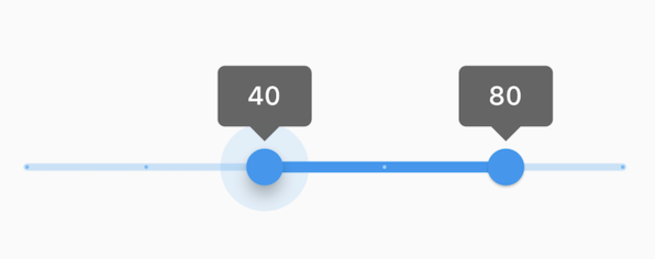
This range values are in intervals of 20 because the Range Slider has 5 divisions, from 0 to 100. This means are values are split between 0, 20, 40, 60, 80, and 100. The range values are initialized with 40 and 80 in this demo.
To create a local project with this code sample, run:
flutter create --sample=material.RangeSlider.1 mysample
A range slider can be used to select from either a continuous or a discrete set of values. The default is to use a continuous range of values from min to max. To use discrete values, use a non-null value for divisions, which indicates the number of discrete intervals. For example, if min is 0.0 and max is 50.0 and divisions is 5, then the slider can take on the discrete values 0.0, 10.0, 20.0, 30.0, 40.0, and 50.0.
The terms for the parts of a slider are:
- The "thumbs", which are the shapes that slide horizontally when the user drags them to change the selected range.
- The "track", which is the horizontal line that the thumbs can be dragged along.
- The "tick marks", which mark the discrete values of a discrete slider.
- The "overlay", which is a highlight that's drawn over a thumb in response to a user tap-down gesture.
- The "value indicators", which are the shapes that pop up when the user is dragging a thumb to show the value being selected.
- The "active" segment of the slider is the segment between the two thumbs.
- The "inactive" slider segments are the two track intervals outside of the slider's thumbs.
The range slider will be disabled if onChanged is null or if the range given by min..max is empty (i.e. if min is equal to max).
The range slider widget itself does not maintain any state. Instead, when the state of the slider changes, the widget calls the onChanged callback. Most widgets that use a range slider will listen for the onChanged callback and rebuild the slider with new values to update the visual appearance of the slider. To know when the value starts to change, or when it is done changing, set the optional callbacks onChangeStart and/or onChangeEnd.
By default, a slider will be as wide as possible, centered vertically. When given unbounded constraints, it will attempt to make the track 144 pixels wide (including margins on each side) and will shrink-wrap vertically.
Requires one of its ancestors to be a Material widget. This is typically provided by a Scaffold widget.
Requires one of its ancestors to be a MediaQuery widget. Typically, a MediaQuery widget is introduced by the MaterialApp or WidgetsApp widget at the top of your application widget tree.
To determine how it should be displayed (e.g. colors, thumb shape, etc.), a slider uses the SliderThemeData available from either a SliderTheme widget, or the ThemeData.sliderTheme inside a Theme widget above it in the widget tree. You can also override some of the colors with the activeColor and inactiveColor properties, although more fine-grained control of the colors, and other visual properties is achieved using a SliderThemeData.
See also:
- SliderTheme and SliderThemeData for information about controlling the visual appearance of the slider.
- Slider, for a single-valued slider.
- Radio, for selecting among a set of explicit values.
- Checkbox and Switch, for toggling a particular value on or off.
- material.io/design/components/sliders.html
- MediaQuery, from which the text scale factor is obtained.
- Inheritance
-
- Object
- DiagnosticableTree
- Widget
- StatefulWidget
- RangeSlider
Constructors
-
RangeSlider({Key? key, required RangeValues values, required ValueChanged<
RangeValues> ? onChanged, ValueChanged<RangeValues> ? onChangeStart, ValueChanged<RangeValues> ? onChangeEnd, double min = 0.0, double max = 1.0, int? divisions, RangeLabels? labels, Color? activeColor, Color? inactiveColor, WidgetStateProperty<Color?> ? overlayColor, WidgetStateProperty<MouseCursor?> ? mouseCursor, SemanticFormatterCallback? semanticFormatterCallback, EdgeInsetsGeometry? padding, @Deprecated('Set this flag to false to opt into the 2024 range slider appearance. Defaults to true. ' 'In the future, this flag will default to false. Use SliderThemeData to customize individual properties. ' 'This feature was deprecated after v3.30.0-0.1.pre.') bool? year2023}) - Creates a Material Design range slider.
Properties
- activeColor → Color?
-
The color of the track's active segment, i.e. the span of track between
the thumbs.
final
- divisions → int?
-
The number of discrete divisions.
final
- hashCode → int
-
The hash code for this object.
no setterinherited
- inactiveColor → Color?
-
The color of the track's inactive segments, i.e. the span of tracks
between the min and the start thumb, and the end thumb and the max.
final
- key → Key?
-
Controls how one widget replaces another widget in the tree.
finalinherited
- labels → RangeLabels?
-
Labels to show as text in the SliderThemeData.rangeValueIndicatorShape
when the slider is active and SliderThemeData.showValueIndicator
is satisfied.
final
- max → double
-
The maximum value the user can select.
final
- min → double
-
The minimum value the user can select.
final
-
mouseCursor
→ WidgetStateProperty<
MouseCursor?> ? -
The cursor for a mouse pointer when it enters or is hovering over the
widget.
final
-
onChanged
→ ValueChanged<
RangeValues> ? -
Called when the user is selecting a new value for the slider by dragging.
final
-
onChangeEnd
→ ValueChanged<
RangeValues> ? -
Called when the user is done selecting new values for the slider.
final
-
onChangeStart
→ ValueChanged<
RangeValues> ? -
Called when the user starts selecting new values for the slider.
final
-
overlayColor
→ WidgetStateProperty<
Color?> ? -
The highlight color that's typically used to indicate that
the range slider thumb is hovered or dragged.
final
- padding → EdgeInsetsGeometry?
-
Determines the padding around the RangeSlider.
final
- runtimeType → Type
-
A representation of the runtime type of the object.
no setterinherited
- semanticFormatterCallback → SemanticFormatterCallback?
-
The callback used to create a semantic value from the slider's values.
final
- values → RangeValues
-
The currently selected values for this range slider.
final
- year2023 → bool?
-
When true, the RangeSlider will use the 2023 Material Design 3 appearance.
Defaults to true.
final
Methods
-
createElement(
) → StatefulElement -
Creates a StatefulElement to manage this widget's location in the tree.
inherited
-
createState(
) → State< RangeSlider> -
Creates the mutable state for this widget at a given location in the tree.
override
-
debugDescribeChildren(
) → List< DiagnosticsNode> -
Returns a list of DiagnosticsNode objects describing this node's
children.
inherited
-
debugFillProperties(
DiagnosticPropertiesBuilder properties) → void -
Add additional properties associated with the node.
override
-
noSuchMethod(
Invocation invocation) → dynamic -
Invoked when a nonexistent method or property is accessed.
inherited
-
toDiagnosticsNode(
{String? name, DiagnosticsTreeStyle? style}) → DiagnosticsNode -
Returns a debug representation of the object that is used by debugging
tools and by DiagnosticsNode.toStringDeep.
inherited
-
toString(
{DiagnosticLevel minLevel = DiagnosticLevel.info}) → String -
A string representation of this object.
inherited
-
toStringDeep(
{String prefixLineOne = '', String? prefixOtherLines, DiagnosticLevel minLevel = DiagnosticLevel.debug, int wrapWidth = 65}) → String -
Returns a string representation of this node and its descendants.
inherited
-
toStringShallow(
{String joiner = ', ', DiagnosticLevel minLevel = DiagnosticLevel.debug}) → String -
Returns a one-line detailed description of the object.
inherited
-
toStringShort(
) → String -
A short, textual description of this widget.
inherited
Operators
-
operator ==(
Object other) → bool -
The equality operator.
inherited