Divider class
A thin horizontal line, with padding on either side.
In the Material Design language, this represents a divider. Dividers can be used in lists, Drawers, and elsewhere to separate content.
To create a divider between ListTile items, consider using ListTile.divideTiles, which is optimized for this case.
The box's total height is controlled by height. The appropriate padding is automatically computed from the height.
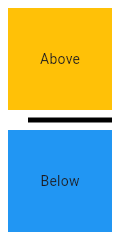
This sample shows how to display a Divider between an orange and blue box
inside a column. The Divider is 20 logical pixels in height and contains a
vertically centered black line that is 5 logical pixels thick. The black
line is indented by 20 logical pixels.
link

To create a local project with this code sample, run:
flutter create --sample=material.Divider.1 mysample
This sample shows the creation of Divider widget, as described in:
https://m3.material.io/components/divider/overview
link
To create a local project with this code sample, run:
flutter create --sample=material.Divider.2 mysample
See also:
- PopupMenuDivider, which is the equivalent but for popup menus.
- ListTile.divideTiles, another approach to dividing widgets in a list.
- VerticalDivider, which is the vertical analog of this widget.
- material.io/design/components/dividers.html
- Inheritance
Constructors
Properties
- color → Color?
-
The color to use when painting the line.
final
- endIndent → double?
-
The amount of empty space to the trailing edge of the divider.
final
- hashCode → int
-
The hash code for this object.
no setterinherited
- height → double?
-
The divider's height extent.
final
- indent → double?
-
The amount of empty space to the leading edge of the divider.
final
- key → Key?
-
Controls how one widget replaces another widget in the tree.
finalinherited
- radius → BorderRadiusGeometry?
-
The amount of radius for the border of the divider.
final
- runtimeType → Type
-
A representation of the runtime type of the object.
no setterinherited
- thickness → double?
-
The thickness of the line drawn within the divider.
final
Methods
-
build(
BuildContext context) → Widget -
Describes the part of the user interface represented by this widget.
override
-
createElement(
) → StatelessElement -
Creates a StatelessElement to manage this widget's location in the tree.
inherited
-
debugDescribeChildren(
) → List< DiagnosticsNode> -
Returns a list of DiagnosticsNode objects describing this node's
children.
inherited
-
debugFillProperties(
DiagnosticPropertiesBuilder properties) → void -
Add additional properties associated with the node.
inherited
-
noSuchMethod(
Invocation invocation) → dynamic -
Invoked when a nonexistent method or property is accessed.
inherited
-
toDiagnosticsNode(
{String? name, DiagnosticsTreeStyle? style}) → DiagnosticsNode -
Returns a debug representation of the object that is used by debugging
tools and by DiagnosticsNode.toStringDeep.
inherited
-
toString(
{DiagnosticLevel minLevel = DiagnosticLevel.info}) → String -
A string representation of this object.
inherited
-
toStringDeep(
{String prefixLineOne = '', String? prefixOtherLines, DiagnosticLevel minLevel = DiagnosticLevel.debug, int wrapWidth = 65}) → String -
Returns a string representation of this node and its descendants.
inherited
-
toStringShallow(
{String joiner = ', ', DiagnosticLevel minLevel = DiagnosticLevel.debug}) → String -
Returns a one-line detailed description of the object.
inherited
-
toStringShort(
) → String -
A short, textual description of this widget.
inherited
Operators
-
operator ==(
Object other) → bool -
The equality operator.
inherited
Static Methods
-
createBorderSide(
BuildContext? context, {Color? color, double? width}) → BorderSide - Computes the BorderSide that represents a divider.